Safe zones: designing one video for nine different UIs
Your video doesn't own its own frame. Every app draws buttons, captions and gradients over it — in different places. Safe zones are how one layout survives all of them.
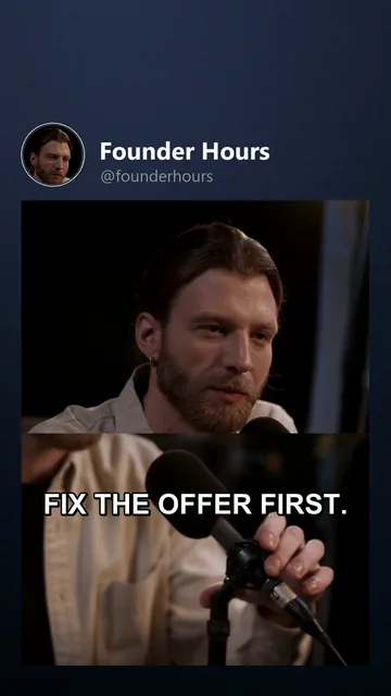 Founder Hours ·TikTok
Post the same 9:16 video to TikTok, Reels, Shorts and Snapchat and it gets overlaid four different ways: action buttons on the right, caption blocks at the bottom, a top bar of context, progress UI, gradients. Anything important you placed there is now underneath an interface.
Since per-platform layouts would kill batch production (the whole economics), the professional answer is one conservative layout that clears every platform's furniture.
The practical safe-zone map
Platforms publish partial specs and they shift with every redesign — so treat these as the battle-tested conservative bands (percent of a 1080×1920 frame):
| Band | Roughly | What lives there |
|---|---|---|
| Top | ~10–12 % (about 200 px) | Status and context bars, search UI, feed tabs |
| Bottom | ~20–25 % (about 400–480 px) | Caption and username block, music line, comment previews, progress bar — the busiest region on every app |
| Right | ~12–15 % (about 150–160 px) | The action rail: like, comment, share, profile |
| Left | a ~5 % inset | The calmest edge — just don't let text kiss the border |
This is why burned-in captions belong in the lower-middle band and never on the bottom edge (captions guide), and why faces and product shots stay clear of the right rail.
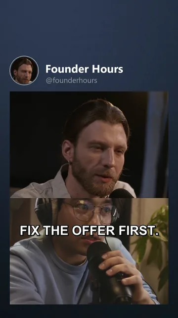 Founder Hours ·Instagram Reels
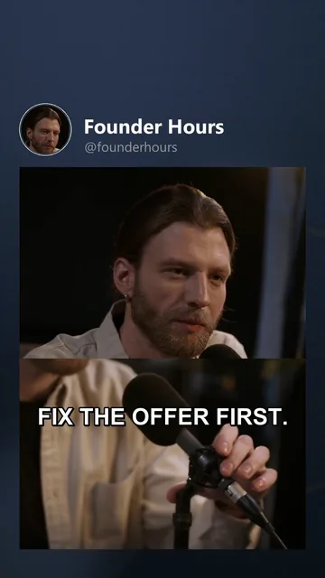 Founder Hours ·YouTube Shorts
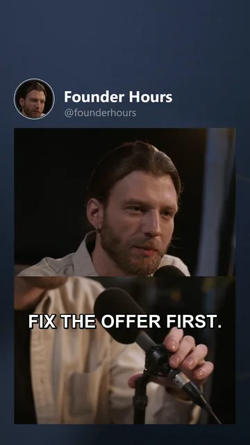 Founder Hours ·Snapchat Spotlight
What remains — the center band, roughly the middle 60–70 % of the frame — is yours everywhere. Hooks, captions, product shots, faces: inside that band they survive all nine UIs.
In VidVertex the canvas plays exactly this game. Switch the safe zones on in the Video tab and each active channel's guides are drawn over the frame while you place text; captions keep their wrap margins inside safe bounds by default (captions docs).
Format-specific wrinkles
- Feed previews crop. Platforms show vertical videos cropped (often toward square-ish) in grids and feed previews — keep the subject of the video centered vertically so crops still read (formats overview).
- Carousels have their own furniture: page dots and swipe hints at the bottom; same rule, stronger — bottom text dies in carousels.
- Stories overlay from both ends (top profile chip, bottom reply box) and are the most aggressive croppers of all; stories content is best designed natively anyway (stories).
The two-minute check that saves re-renders
Before a batch: take one frame of your layout and put a phone screenshot of TikTok's UI over it — right rail, bottom block. If your hook text, captions and CTA all sit clear, that layout is done for every platform; save it as your template and stop thinking about it. If you keep one platform-specific layout in your life, make it "none".
Three symptoms of broken safe zones, found in the wild: comments quoting your text wrong (they read it half-covered), retention dropping exactly when on-screen text matters (the curve points at it), and your own posts looking different in-app than in your editor. All three have the same fix — pull everything toward the middle band.
 START HERE · 3 MINCross-posting right: what actually differs between platforms"Just post it everywhere" is correct — and still done wrong most of the time. The differences that matter aren't the ones people obsess over.
 THE CRAFT · 3 MINWhy burned-in captions lift retentionA huge share of feed scrolling happens with the sound off. Captions aren't decoration — they're the sound-off version of your video.
 THE CRAFT · 4 MINEvery post format, every platform — and what a video pipeline covers"Posting content" means five different things depending on the app: feed videos, stories, carousels, text posts, lives. Here's the format map, the platform-by-platform table, and which of them batch production reaches.